Pressure vessels used for high-temperature dissolution of zircon. Image credit: Bill Mitchell (CC-BY).
When scientists are measuring the uranium and lead in a rock—specifically in the mineral zircon, found in many igneous rocks—to determine its age (U/Pb geochronology), they need to dissolve the zircon. Zircon is a very stable mineral, so to dissolve zircon, the mineral grains are subjected to acids at high temperatures (~200 °C) and pressures. Thick steel pressure vessels are needed to contain an inner teflon vessel when it heats up and the liquid inside boils.
In the picture above, there are two pressure vessels. On the right of the red marker, a smaller vessel is used when the zircons from one rock sample are being partially dissolved to remove the exterior surface (chemical abrasion). To the left of the red marker, the large vessel is used for the final dissolution, when zircon grains are on teflon racks with individual teflon capsules.
Terra satellite being prepared for placement in the payload fairing. Image credit: NASA (public domain).
In my previous post on satellite communications, I discussed two types of satellites: geostationary and low-Earth-orbit. One of NASA’s low-Earth-orbit satellites, orbiting at an altitude of 705 km (438 mi), is Terra.
Launched in December of 1999, Terra is in a polar orbit, and is sun-synchronous—it makes its north-to-south pass on the daylight side of Earth, crossing the equator around 10:30 AM in the local time zone. As 10:30 AM moves around the Earth, so too does Terra, with each orbit taking 99 minutes.
Aboard Terra is one of my favorite instruments: the MODerate resolution Imaging Spectroradiometer, or MODIS. Unpacking the name, we find that MODIS has moderate resolution: its best resolution is about 250 m/pixel. It is an imaging instrument (i.e. it sends back pretty pictures), and it is a spectroradiometer, meaning that it measures the amount of light (radiometer) across a spectrum of wavelengths (visible and infrared, in this case). Most of my use of the instrument is for its true-color imagery, or “Bands 1-4-3” (corresponding to red, green and blue). An example image is shown below.
Minneapolis area seen by NASA’s Terra satellite Sept. 30, 2015. The Minneapolis and St. Paul airport is the concrete-colored smudge just left of center; St. Cloud is in the upper left, Winona toward the bottom right, and at furthest bottom right is La Crosse, WI. Image credit: excerpt from NASA imagery (public domain).
MODIS is a push-broom type imager. It takes one very wide “picture” (2,330 km East-West), and splits that into 36 spectral bands. As the spacecraft flies (North-to-South), those wide “pictures” are put together along the track of the satellite to create a swath image. The instrument’s resolution is highest at the center of the image.
One great thing about MODIS is that it has pretty good spatial coverage (that’s the advantage of the moderate resolution). In 24 hours, it will get images of most of the Earth, but with a few gaps between swaths at the equator. Orbits are offset day-to-day (with a 16-day cycle), so it takes two days to get full global coverage. Global maps are produced daily (give or take) by NASA Earth Observations, and tend to have a day or two of lag behind real-time.
Terra MODIS image of Earth, Oct. 7, 2015. The tan-grey streaks in the center of the swath over some equatorial regions is caused by glare from the sun reflecting off the ocean surface. Image credit: NASA Earth Observations (public domain).
You may notice that in the picture of the whole world, Antarctica is nicely lit up, but the data for the North pole is missing? What’s up with that? Is NASA taking part in a conspiracy with Santa to hide his gift-production and distribution facilities?
In a word: no.
In more words, having recently passed the September equinox (autumnal equinox to folks in the northern hemisphere), the North pole is now in darkness at 10:30 AM “local time”. It doesn’t really matter what you choose as local time, because it’s dark regardless. With it being dark, the instrument is off.
Beyond pretty pictures, Terra MODIS is used for scientific purposes. Its images can detect wildfires,[1] be used to estimate area burned by fires, monitor drought severity and snow cover, study aerosols and atmospheric pollutants, and even chlorophyll (phytoplankton) concentrations in the ocean.
Using the images to understand the productivity of plants can in turn influence the estimates for how much carbon is being removed from the atmosphere, and can serve as a gauge of ecosystem health in remote areas. Volcanic eruptions, major wildfire events, and even thick pollution from human sources can be seen in these images. By analyzing MODIS data, scientists can gauge how much of various types of atmospheric gases are being emitted by wildfires.[2, 3]
***
[1] Near-real-time swath data are available from the Rapid Response website.
[2] Mebust, A. K., Russell, A. R., Hudman, R. C., Valin, L. C., and Cohen, R. C.: Characterization of wildfire NOx emissions using MODIS fire radiative power and OMI tropospheric NO2 columns, Atmos. Chem. Phys., 11, 5839-5851, doi:10.5194/acp-11-5839-2011, 2011. [Open access]
[3] Mebust, A. K. and Cohen, R. C.: Space-based observations of fire NOx emission coefficients: a global biome-scale comparison, Atmos. Chem. Phys., 14, 2509-2524, doi:10.5194/acp-14-2509-2014, 2014. [Open access]
Recording rock core orientation for paleomagnetic analysis. Image credit: Bill Mitchell.
I’ve touched on paleomagnetism a little bit before, both as a technique for tying rocks in to the geologic timescale, and as something which can be found by using a fluxgate magnetometer. It’s a pretty interesting set of techniques and uses some cool science tools, so I thought I’d explain a little bit more.
Magnetism from the Earth’s magnetic field can be retained by individual layers of rocks, at least under some circumstances. If you have a bunch of layers stacked on top of each other like pancakes, the different layers (beds) can have different magnetic directions.
Stack of banana-walnut pancakes. Although probably low on magnetic minerals and too thin individually for magnetic coring, they do illustrate the concept of layering quite nicely. Image credit: Jack and Jason’s Pancakes (CC-BY-SA).
As you might expect, the equipment needed to make sensitive measurements of the magnetic field are not particularly portable (and may be a topic for another post). Samples need to be collected in the field and brought back to the lab, and the sample orientation must be marked and recorded in such a way that the measured magnetic field can be related back to the magnetic field in the rock itself.*
To do that, paleomagnetists (or paleomagicians) will drill a small (1″ diameter by a few inches long) annular hole into the rock, leaving a plug of rock in the center. That will become the sample. Before it can be removed from the hole, a mark is made on the top of the plug with a brass rod. The direction of the hole is determined with a compass (or a sun compass when conditions allow), as is the angle away from vertical of the core (the hade).
When the plug is freed from the rock, the down-hole direction is marked with arrows along the mark using a permanent marker. The samples (several from each bed) are then placed into sample bags, labelled appropriately, and carefully transported back to the lab.
Are you irresistibly attracted to such a magnetic field of study? This is probably the best place to go for more information, and is freely accessible online.[1]
QGIS screenshot, showing Heard Island. Brown is land/rock, blue are lagoons, and the dotted white is glacier.
One of a geoscientist’s most useful tools is a geographic information system, or GIS. This is a computer program which allows the creation and analysis of maps and spatial data. Perhaps the most widely used in academia is ArcGIS, from ESRI. However, as a student and hobbyist who likes to support the open-source software ecosystem, I use the free/open-source QGIS.
QGIS can be used to make geologic maps of an area, chart streams, and note where certain geologic features (e.g. volcanic cones) are present. For instance, at the top of this post is a map of Heard Island that I’ve been playing with, from the Australian Antarctic Division. It is composed of three different layers, each published in 2009: an island layer (base, brown), a lagoon layer (middle, blue), and a glacier layer (top, dotted bluish-white).
I believe I have mentioned here previously that one interesting thing about working with Heard Island is that with major surface changes underway (glacial retreat, erosion, minor volcanic activity), the maps become obsolete fairly quickly. This week I have been learning about creating polygons in a layer, so that I can recreate a geologic map from Barling et al. 1994.[1] One issue I’ve come up against, though, is that the 1994 paper has some areas covered in glacier (from 1986/7 field work), whereas my 2009 glacier extent map shows them to be presently uncovered. In fact, even the 2009 map shows a tongue of glacier protruding into Stephenson Lagoon (in the southeast corner), while recent satellite imagery shows no such tongue.
During the Heard Island Expedition in March and April, 2016, I hope that we will have time to go do a little geologic mapping. Creating some datasets showing the extent of glaciation (particularly along the eastern half of the island) and vegetation, as well as updating the geologic map to include portions which were glaciated in 1986/7, would be a worthwhile and seemingly straightforward project.
QGIS itself is much more than a mapping tool (not that I know how to use it), and can analyze numeric data which is spatially distributed, like the concentration of chromium in soil or water samples from different places on a study site. QGIS provides a free way to get your hands dirty with spatial data and mapping, and is powerful enough to use professionally. Users around the globe share information on how to use it, and contribute to its development.
For those looking to go into geoscience as a career, I would strongly recommend learning how to use it. I didn’t learn GIS in college (chemists don’t use it much), and somehow avoided it in grad school. But I regret not having put time in to learn it sooner. There’s all kinds of interesting spatial data, and a good job market for people with a GIS skillset (or so I hear). I have only scratched the surface of QGIS’s capabilities with my use of it, but I definitely intend to keep learning. You can probably follow the day-to-day frustrations and victories on my Twitter account (@i_rockhopper).
***
[1] Barling, J.; Goldstein, S. L.; Nicholls, I. A. 1994 “Geochemistry of Heard Island (Southern Indian Ocean): Characterization of an Enriched Mantle Component and Implications for Enrichment of the Sub-Indian Ocean Mantle” Journal of Petrology 35, p. 1017–1053. doi: 10.1093/petrology/35.4.1017
Neodymium-doped yttrium aluminum garnet (Nd:YAG) laser, open to show internals. Image credit: Kkmurray (CC-BY).
Lasers are a fairly charismatic tool for scientists to use—using a laser is an obvious sign that science is happening in some way shape or form, especially if the laser has many hazard warnings on and around it.
Their applications, even within geoscience, are quite varied. They put the “Li” in “LiDAR.” Lasers are also used to turn very small portions of rocks into tiny dusty bits, in a process called laser ablation (the LA of LA-ICP-MS).
One tricky problem in geochemistry is that of analyzing rocks with a mass spectrometer. Mass spectrometers work only on ionized gases (or plasmas), and rocks are pretty solidly solids. In order to get them into a mass spectrometer, you need to break them down somehow, either through acid digestion or other dissolution method, or by vaporizing/blasting them with lasers.
Laser ablation works because lasers—particularly pulsed lasers—can emit a great deal of energy into a small volume very, very quickly. As I expect you know, rocks are not especially thermally conductive, so when they are heated up by all the laser energy coming in, it doesn’t have anywhere to go and the small volume of rock heats up and is broken into dust fragments and/or vaporized. By flowing a gas like helium or argon over the sample, this dust can be swept along into the plasma torch of an inductively-coupled-plasma mass spectrometer and analyzed.
Lasers used for ablation can be focused to very small spot sizes, from 2 μm to 1200 μm (=1.2 mm). These spot sizes are small enough that zones within a crystal, such as growth bands or inclusions, can be analyzed separately.
For atmospheric work, lasers can be used for spectroscopy, or at least probe the concentration of certain molecules (e.g. H2O, CO2). One of my favorite instruments (perhaps deserving its own Geoscientist’s Toolkit post) is the cavity ringdown spectrometer, where a laser illuminates a cavity with highly-reflective—but not completely reflective—mirrors containing a sample gas between them. A detector then measures the time it takes once the laser is shut off for the light to bleed out of the cavity (ms). From the ringdown time, the concentration of the gas of interest can be measured with high precision, even at very low concentrations. It’s pretty neat.
Really, there are a lot of geoscience things one can do with lasers: this is just a smattering of those uses of the tool.
Exploring other worlds up close, and which are different from our own, can be very informative. We may have theories about the composition of worlds like Pluto, of how it formed, how it behaves, and what its surface is like. However, it is not until we go there that we can truly test those hypotheses. In many cases, when we are dealing with worlds vastly different from our own, what we find is surprising, mysterious, and awe-inspiring.
For instance, most pre-New Horizons models would have made Pluto out to be a fairly heavily cratered object, not unlike the Moon. However, that was not at all what was found. The first high-resolution picture released during the flyby, part of a mosaic which is still being put together, had no craters visible. None.
High-resolution image of Pluto’s surface, near Tombaugh Regio, taken from 77,000 km above the surface. Notice the lack of craters in this image. Image credit: NASA/Johns Hopkins University Applied Physics Laboratory/Southwest Research Institute.
Given that the history of Pluto is likely to have included significant bombardment by smaller objects, this result makes us rethink our model of the processes happening on Pluto’s surface. From what we know of the frequency of impacts, these surfaces would need to have been recently (geologically speaking, so in the last ~100 Ma) formed, eroded, or otherwise modified.
It is encounters like this which help us understand and consider our models, and to recognize which properties of large rocky bodies are important under which circumstances. What is reshaping Pluto’s surface? How did the various terrains form? Do they happen elsewhere? Where does the energy for these processes come from?
Exploring other worlds keeps our thinking fresh, challenges our assumptions, and inspires us to create new models and experiments to better understand our solar system and our own Earth.
The fluxgate magnetometer—not to be confused with the flux capacitor—is a nifty tool for determining the strength and direction of a magnetic field.
It works by using an alternating current to induce an alternating magnetic field in a magnetically permeable core (ferrite core), saturating the core. The magnetic field then induces a current in a secondary winding. My apologies for not having an open-use schematic, but the ones here and here are quite good, plus have a more nuanced explanation.
Absent an external field, the induced current will be equal to the driving current. However, in a magnetic field, one direction will saturate more easily and the other less easily, because the permeable core will be reacting to the external field. As a result, the secondary windings will have a current imbalance when compared to the driving winding, and the imbalance will show up both on the rise and fall of the driving waveform. The imbalance has a frequency of twice the drive frequency. Also, this design detects magnetization in one direction only. For a full 3D characterization of the direction of the magnetic field, it takes three magnetometers, each perpendicular to the others.
One of the early applications of fluxgate magnetometers was the detection of submarines (large metallic bodies). Indeed, through this type of study, the alternating magnetization of rocks along the sea floor of the Atlantic Ocean was discovered, with bands parallel to the Mid-Atlantic Ridge. These data gave strong evidence in support of plate tectonics.
But the magnetometer’s usefulness doesn’t stop there! Earth’s magnetic field extends out into space, where it interacts with magnetic fields from the solar wind. By measuring the magnetic fields, scientists can study the interactions between Earth’s magnetosphere and the solar wind, interactions which can give us auroras.
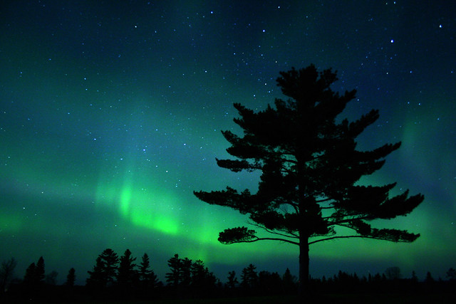
Aurora in Minnesota. Image credit: Charlie Stinchcomb (CC-BY)
Perhaps an even more exciting application is the study of magnetic fields near the Moon. NASA’s ARTEMIS mission (using repurposed THEMIS spacecraft) is flying two magnetometers around the Moon. Heidi Fuqua, a scientist at UC Berkeley, and her collaborators are using the magnetic data gathered by the ARTEMIS satellites to study the Moon’s interior. Depending on the size and conductivity of the Moon’s interior, the magnetic field will have differing responses to the induced magnetic field from the solar wind. It’s pretty neat stuff!
Heavy liquid separation. Mixed dense (red) and light (purple) minerals are poured into a liquid of intermediate density and stirred. After they come to equilibrium, the dense mineral(s) will sink, and the light mineral(s) will float. Image credit: Bill Mitchell (CC-BY).
When purifying a mineral from whole rock, one of the most useful separations is by density. Water, being less dense than most rock, is not especially useful for this. However, lithium metatungstate (LMT, mixed with water) and sodium polytungstate (SPT, also mixed with water) can create denser—albeit more viscous—liquids, with densities approaching 2.9–3.1 g/cm3. These denser liquids are enough to separate feldspar and quartz (<2.7 g/cm3) from zircon, titanite (sphene), and barite (densities >3.5 g/cm3).
Separations are fairly straightforward. A crushed, sieved rock sample is poured into a separatory funnel filled 1/2–2/3 full with the heavy liquid. The slurry is stirred vigorously with a stirring rod, and allowed to settle (it may take a couple hours if the grain size is fine and the liquid viscous). After it settles, the dense minerals should have sunk to the bottom, while the light minerals will float. A filter funnel is then placed under the separatory funnel. When the stopcock is opened, the dense minerals and some of the heavy liquid will pour out the bottom. The stopcock is then closed when the heavy separate has passed through. A second filter funnel is then used to capture the light fraction. With good filtering, the heavy liquid can be reused. The separates can be washed with distilled water and dried.
Heavy liquid separation is often used in combination with magnetic separation to purify minerals for analysis. Depending on the difference in densities being separated, a liquid may need to be fairly precisely calibrated with larger samples of the desired minerals. Sanidine (~2.55 g/cm3) and quartz (~2.65 g/cm3) need a well-calibrated liquid to achieve good separation, while either (or both) of them from zircon can be done with any LMT solution >2.7 g/cm3.
Maps are neat. Geologic maps in particular can be quite interesting (see above, particularly the original PDF). These are the product of detailed surveys, which are undertaken both at the federal and state level, and show which rock types are found in which regions. Some of these rocks can be traced over long distances (like the sedimentary rocks of the southeastern corner of Minnesota), while others are localized.
Geologic maps give a summary of what types of rocks are in which areas. From this, you can find out search terms to get you to more information about certain rocks, or you can use the rock type to determine what used to be happening in an area. For instance, southeastern Minnesota was once covered by a warm, shallow sea, leading to sandstone, limestone, and dolostone formation. Some of the limestones are fossiliferous. Northeastern Minnesota used to be home to a volcanic rift valley (like the one presently in East Africa) and is home to volcanic rocks, such as the North Shore Volcanic Group.
In addition to the short description of the rock units, geologic maps will give the estimated age range of the rocks (if you need a refresher on geologic time, see this post). A quick glance at the time scale will show you that although you may find fossils in southeastern Minnesota, don’t expect to find any dinosaurs (they existed during the Mesozoic)!
Faults are mapped as well, either transform (offset side-to-side), thrust (compressing, one side going up), or normal (expanding, one side falling). Dikes, which are ribbon-like intrusions which cut through the local rock, are mapped as lines. Because they need to cut through the local rock, they are inherently younger than the rock which they cut through—thus a radioisotopic age for the dike will be a minimum age for the unit it intrudes.
There are also several different types of geologic maps. Bedrock maps, such as the one above, show what the primary consolidated rock is, although it may be buried beneath loosely packed, more recent sediments. Surficial maps show more recent deposits; here in Minnesota, that’s often glacial deposits of various types, but can also include features such as alluvial fans and landslide deposits.
Finding geologic maps here in the US can be a little bit tricky. The USGS has nice geologic maps (start here), but they tend to be large-area. State surveys seem to have more detailed local maps, but each state has their maps in a different location and the availability may not be consistent state to state. Montana has a nice geologic map interface on their website, while Minnesota’s geologic maps are not easily found—there are county-scale surficial geologic maps, at least for some counties, but I’ve really only been able to find them through third-party search engines. For advanced map users, the state surveys will often make the raw GIS (geographic information system) data available.
Silicic dike in the Benton Range, near Bishop, CA. Image credit: Bill Mitchell.
Have you ever developed your own activities for doing outreach related to your research? Or wanted to find a way to teach a geoscience concept to a class?
There is a great resource available for this kind of thing: the Science Education Resource Center, at Carleton College [my alma mater].
From demos to lab ideas to tutorials on how certain types of equipment work, SERC has lots of great material. Of course, it doesn’t just appear out of nowhere. If you have taken the time to develop an interesting and useful activity, guide, or lab, you can submit the materials for others to use (under a Creative Commons license).
I have used SERC to get activities on dinosaurs (this one on calculating the speed of dinosaurs was awesome!), as well as to find good resources on mineralogy (my background as a chemist left me a bit behind mineralogy/petrology when I joined an Earth Science research group). There are activities and discussions around topographic maps, glaciers, climate change, groundwater, and the geologic timescale (my introduction to the geologic timescale, which isn’t on SERC, can be found here).
SERC is a great resource, and they hold workshops/webinars too!